Uppercase and Lowercase: How the Alphabet Got Two Sets of Letters
The Romans never wrote a lowercase letter. Our "small letters" took more than a thousand years to appear, and their name comes from a printer's drawer.
Every time you press Shift, you are switching between two alphabets with very different histories. Capitals come from letters carved in Roman stone. Lowercase letters grew out of everyday handwriting, were polished by medieval monks, revived by Renaissance scholars, and fixed in metal by printers. Here is how one alphabet became two.
One alphabet, one size
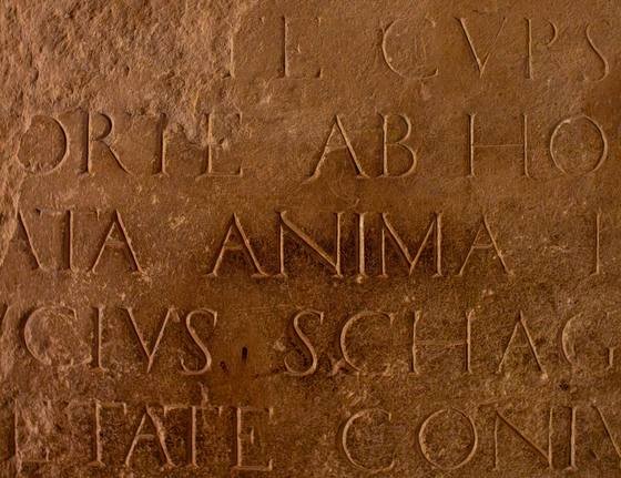
Ancient alphabets had only one form of each letter. Phoenician, early Greek and Latin had no "capitals" and "small letters," just letters. Because the best-known Roman texts are carved inscriptions, the Latin letters we know from that era look like our capitals: straight lines, careful curves and wide, geometric shapes that a chisel could cut cleanly into stone. The inscription on the base of Trajan's Column in Rome, carved in 113 CE, is still a model for type designers today.
Faster pens, rounder letters
Romans didn't write everything in stone. For letters, accounts and notes, they scratched wax tablets or wrote with ink on papyrus, and there speed mattered more than beauty. Lifting the pen for every stroke of a capital was slow, so writers joined strokes, rounded corners and let some letters climb above or dip below the line. This everyday Roman cursive was often hard to read, but it planted the seeds of lowercase.
Book scribes then developed calmer, rounder scripts that borrowed some of those shapes:
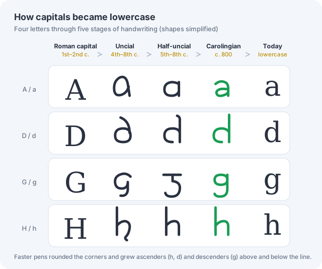
- Uncial (roughly the 4th to 8th centuries) used rounded forms of A, D, E, H and M. Its letters were still all one size, but they were no longer the stone capitals.
- Half-uncial (roughly the 5th to 8th centuries) went further. Letters such as b, d, h and l grew tall ascenders, while g, p and q gained descenders. It was, in effect, the first lowercase-looking alphabet.
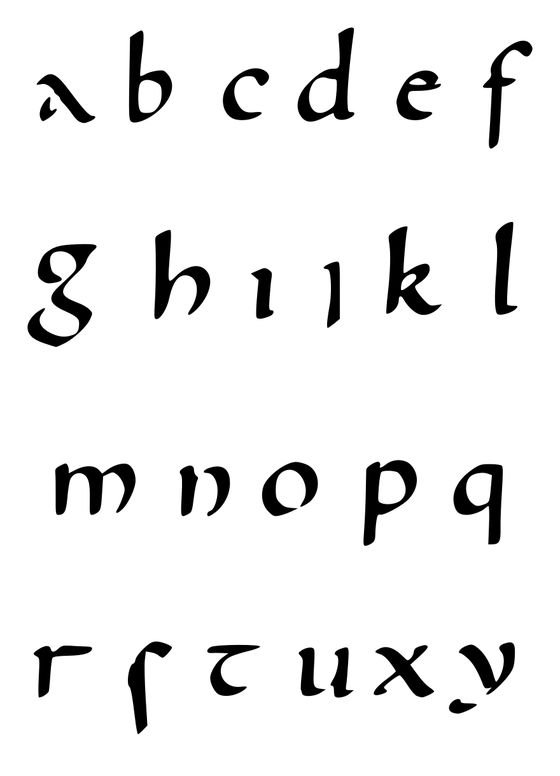
Writing material may have played a part too. Parchment, made from animal skin, was expensive, and narrower, rounder letters fit more words on each page. Historians see that as one pressure among several, alongside speed and local tradition.
Carolingian minuscule: the real ancestor
By the 700s, handwriting across Western Europe had split into many regional styles, some very hard to read outside their home monastery. Around the late 8th century, a clear new script appeared in the Frankish kingdom: Carolingian minuscule ("minuscule" means small letters; capitals are "majuscules").
It had round, separate letters, consistent ascenders and descenders, and spaces between words. It is the direct ancestor of the lowercase you are reading now.
The usual story says the scholar Alcuin of York invented it for Charlemagne. The truth is more interesting. The earliest examples come from the abbey of Corbie in northern France, and a 2012 study dated one Corbie manuscript to before Charlemagne's reign. Charlemagne's push for correct, standard texts helped the script spread. Alcuin, who became abbot of Tours in 796, ran one of the busiest scriptoria promoting it. But neither man created it.
Carolingian scribes used old Roman capitals for titles, headings and the first letter of a section. That is the start of the two-case idea: big letters to mark structure, small letters to carry the text. The rules we use today, with a capital at the start of every sentence and every name, came much later.
Gothic detour and Renaissance revival
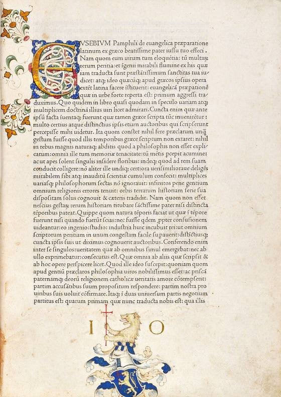
From about the 12th century, scribes in much of Europe compressed Carolingian letters into dense, angular Gothic script, also called blackletter. It is the style of the Gutenberg Bible. Johannes Gutenberg printed in blackletter around 1455, not in the round letters we use today.
Our lowercase came back through Italy. Around 1400, humanist scholars such as Poggio Bracciolini, tired of crabbed Gothic hands, copied the clear script of old manuscripts, which they believed was ancient Roman. It was actually Carolingian. Their humanist minuscule was paired with Roman inscriptional capitals, and Italian printers turned the combination into type. Nicolas Jenson's roman type, used in Venice in 1470, is one of the most admired early examples. In 1501 the Venetian printer Aldus Manutius added a slanted, handwriting-based style: italic.
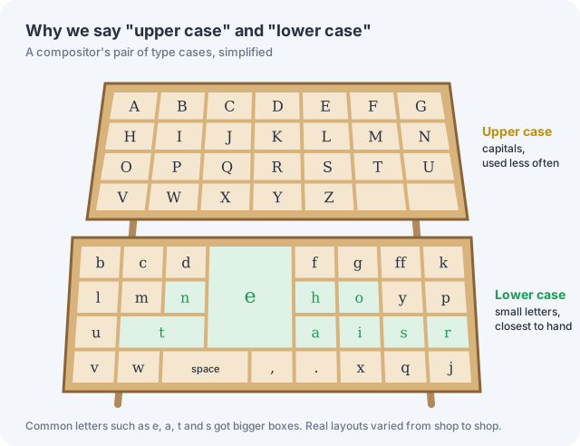
Why they're called "upper case" and "lower case"
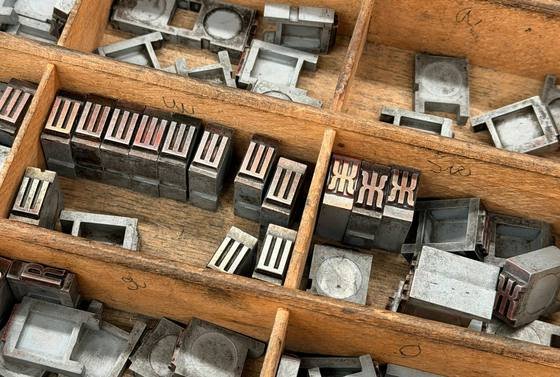
A printer, or compositor, built each line letter by letter from metal type kept in shallow wooden trays called cases. In the classic English arrangement, two cases sat on a sloping stand. The capitals went in the case above, the upper case, and the small letters in the case below, the lower case, nearer the compositor's hands, because they were needed far more often. The most common letters, such as e, got the largest compartments.
The terms are younger than printing itself. Their earliest recorded use is in Joseph Moxon's printing manual Mechanick Exercises, published in London in 1683. "Capital," from the Latin for "head," had been in use since the 1300s.
From type cases to keyboards and code
The first commercial typewriters printed capitals only. In 1878 Remington's second model added the Shift key, which physically shifted the mechanism so each typebar could print two characters, as we describe in the history of the keyboard. Computers inherited the split. In the ASCII code of the 1960s, capital A is number 65 and small a is 97, exactly 32 apart. That neat gap made converting between cases simple for early programmers.
Case also changes meaning: Polish and polish, March and march, Turkey and turkey. That is why passwords and many programming languages treat A and a as completely different characters.
Is lowercase really easier to read?
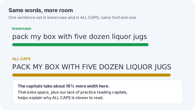
Yes, a little. Studies going back to the 1930s found that people read lowercase text roughly 5–10% faster than text in ALL CAPS. Capitals also take more room: the same sentence set in capitals can be noticeably wider, so the eye has more distance to cover.
A popular explanation says lowercase words have distinctive outlines (the "Bouma shape," made by ascenders and descenders) that the brain recognizes at a glance. Reading research doesn't support it. Experiments show we recognize the individual letters of a word in parallel, very fast, not its outline. Lowercase wins mainly through practice: we read it far more often. Readers who practice ALL CAPS get faster at it.
Uppercase and lowercase at a glance
| When | What happened |
|---|---|
| 1st–2nd century | Roman capitals carved in stone; Roman cursive used for everyday writing |
| 4th–8th century | Rounded uncial and half-uncial book scripts |
| Late 8th century | Carolingian minuscule appears, with early examples from Corbie |
| 796 onward | Alcuin's scriptorium at Tours helps spread it |
| 12th–15th century | Gothic blackletter dominates; Gutenberg prints in it (c. 1455) |
| c. 1400 | Italian humanists revive Carolingian-style minuscule |
| 1470 | Nicolas Jenson's roman type in Venice |
| 1501 | Aldus Manutius introduces italic type |
| 1683 | "Upper case" and "lower case" first recorded, in Moxon's printing manual |
| 1878 | The Shift key appears on typewriters |
Only a handful of the world's writing systems have two cases, among them Latin, Greek, Cyrillic and Armenian. Arabic, Hebrew, Chinese, Japanese, Korean and the scripts of India manage perfectly well with one. For how those systems began, see From Speech to Script and our history of writing.
Switch case in one click
Fix text typed with Caps Lock on, or convert to UPPERCASE, lowercase, Title Case or Sentence case with our free Case Converter.
Open the Case Converter →Frequently asked questions
Why are they called uppercase and lowercase?
Printers stored capital letters in a type case placed above the case holding small letters. The terms "upper case" and "lower case" are first recorded in Joseph Moxon's printing manual of 1683.
Did the Romans use lowercase letters?
No. Latin had a single set of letters. Our capitals descend from Roman inscriptions, while lowercase grew out of later handwriting, especially Carolingian minuscule of the late 8th century.
Who invented lowercase letters?
No single person. Lowercase developed gradually from Roman cursive, uncial and half-uncial scripts. Carolingian minuscule, whose earliest examples come from the abbey of Corbie, gave it its lasting form.
Is ALL CAPS harder to read?
Slightly. Studies found lowercase is read about 5–10% faster, mostly because we are more practiced at reading it and because capitals take up more space.